Designing a New In-App Analytics Tool for Teachers to Track Pupils Activity

Overview
About
TUTOR is an educational app designed to help schools and teachers support their pupils in independently filling knowledge gaps in maths. However, many customers are hesitant to use our in-app analytics tool, perceiving it as unreliable, complex, and difficult to access relevant data.
By addressing these challenges, we aim to make TUTOR's analytics feature indispensable to our users, improving customer retention and driving new sales.
Challenge
Solution
Redesigned the analytics tool to be intuitive, reliable, and visually aligned with the TUTOR platform.
Implemented user-focused improvements to simplify navigation and data accessibility, enabling customers to easily extract meaningful insights.
Established a cohesive design language that aligns with TUTOR’s brand, even in the absence of existing guidelines.
Prioritised key features based on customer feedback to deliver maximum value with minimal resources.
Impact
Eliminated the need for external analytics tools (such as PBI), leading to significant cost savings.
After three months, 42% of returning users were actively engaging with the new in-app analytics tool
Strengthened customer trust and satisfaction
Role
As the Product Designer in a small, cross-functional team (Product Owner, Web Developer), I worked on UX research and design, including:
User and stakeholder interviews
Usability testing
Competitor analysis
Behavioural tracking
Creating personas, wireframes, mockups and prototypes
Timeframe
The project was carried out over six months, from December 2023 to June 2024.
Educators avoid using our current analytics solution because they find it inconvenient and cumbersome.
Current solutions
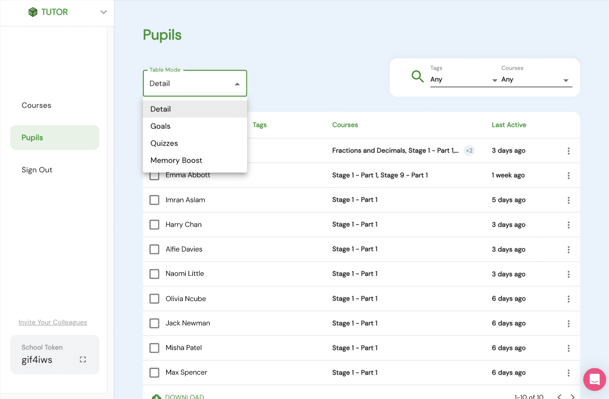
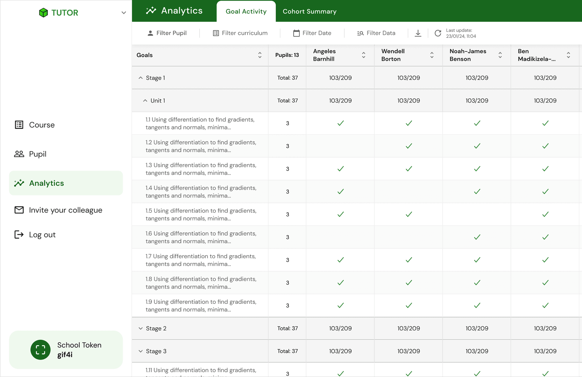
An in-app table providing brief information, such as the number of goals (lessons) pupils have completed over a specified period.
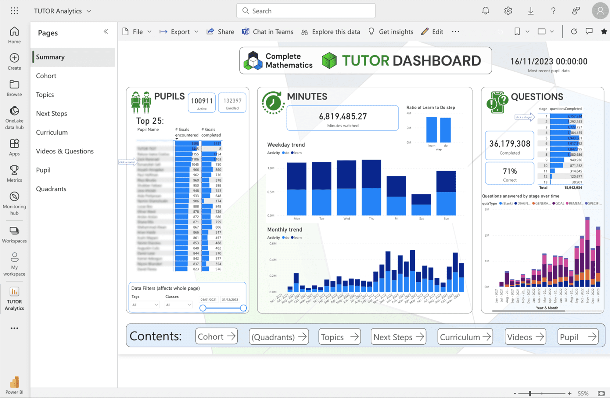
Power BI provides more granular information about the pupils and class, including details on what they completed in the curriculum
A minimal scope to address the key issues within a short timeframe.
Given our small team and the potential scale of the project, our goal was to deliver a minimal viable solution that addressed the key issues within a short timeframe. We defined the MVP version and what we wanted for the first release (MVP + a couple of additional feature that seemed to be not completely necessary but important)
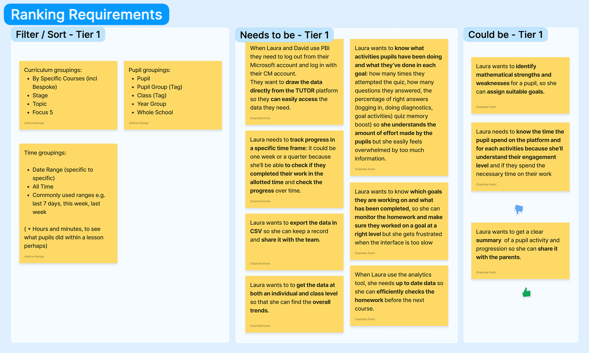
Our approach was to organise the user stories by priority and stages of release.
The table seems to be the best approach to convey the data
Given our small team and the potential scale of the project, our goal was to deliver a minimal viable solution that addressed the key issues within a short timeframe. We defined the MVP version and what we wanted for the first release (MVP + a couple of additional feature that seemed to be not completely necessary but important)
The team translated the needs into functionalities and prioritised them for the next release stages
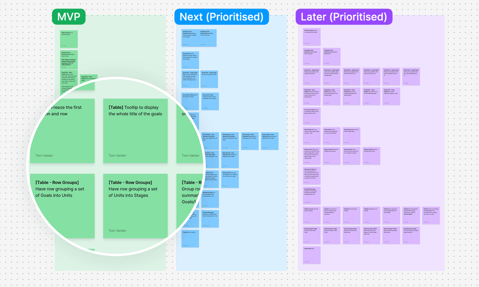
We prioritised the needs of Heads of Maths and teachers, who form the majority of our users and use the tool most frequently.
👤 User Personas


User Need

Pain Points
Iterations: From the spreadsheet version to the first mockup
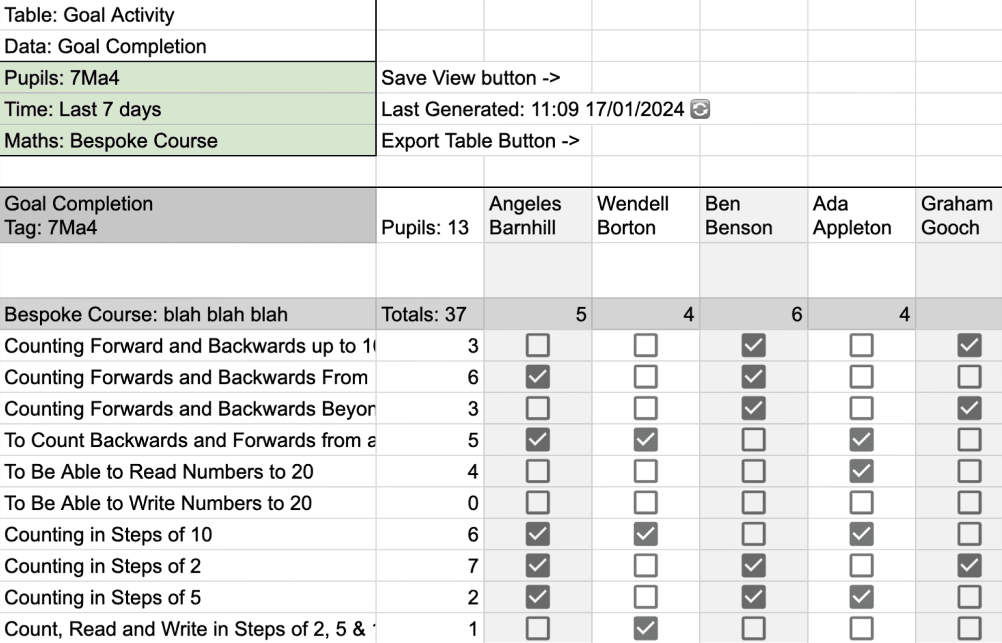
Spreadsheet
We explored Google Sheets to create an initial draft with various potential views and filters.
We determined that an "all curriculum" view is essential for a whole class, so we considered using horizontal scrolling to accommodate this
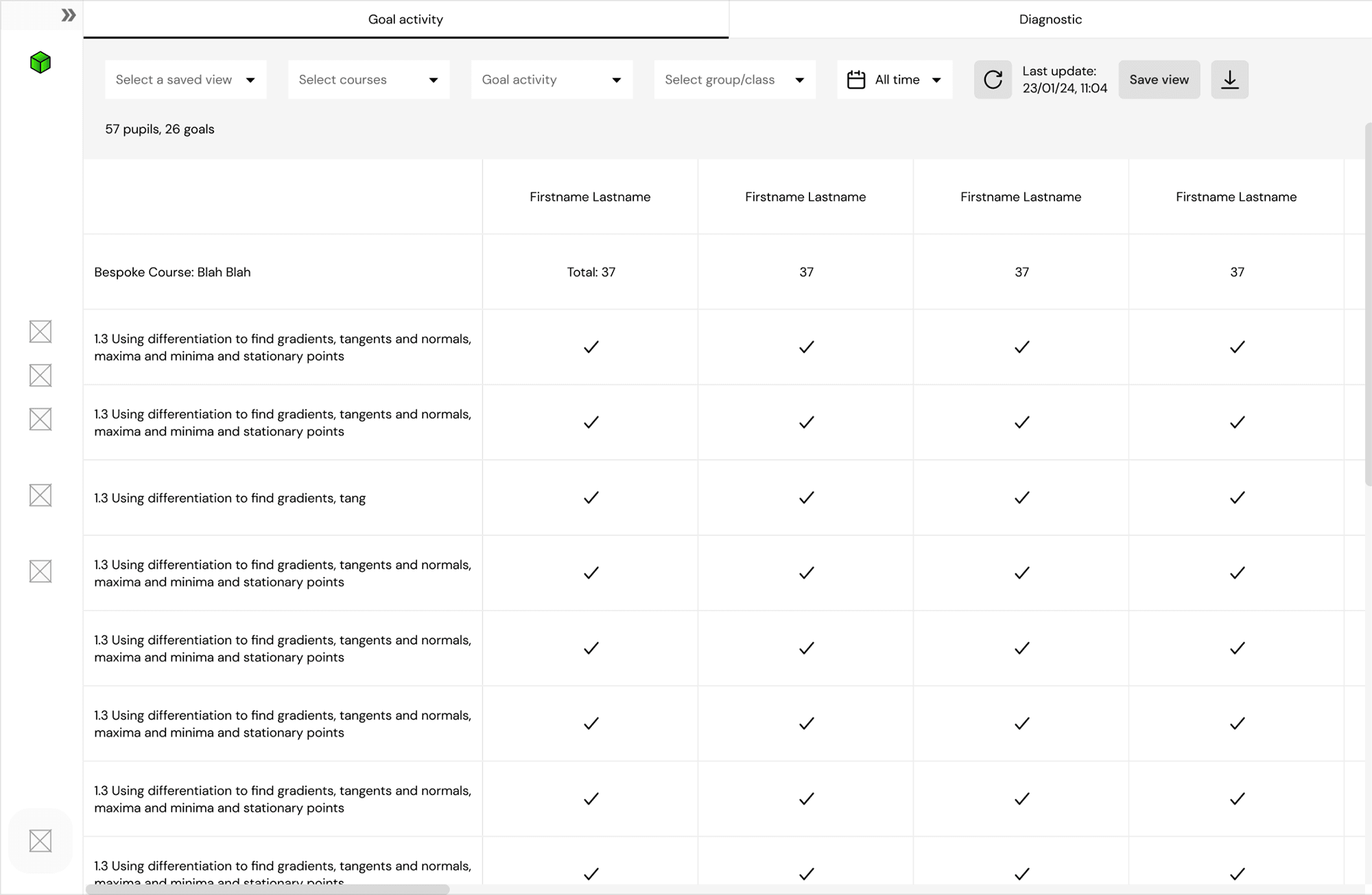
UI exploration
We explored different colours, type of filters
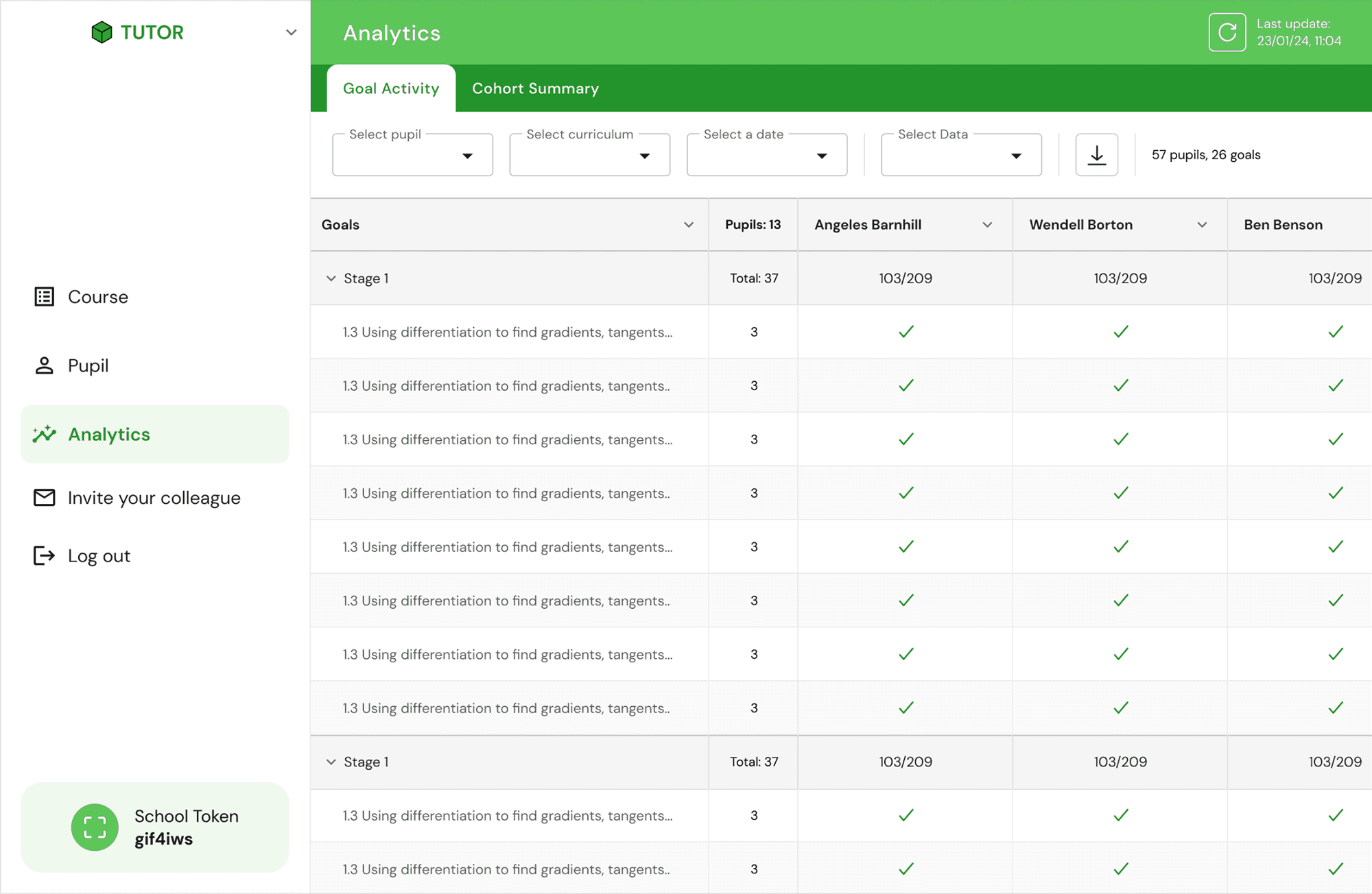
First version
We opted for a dark green to ensure a contrast that make the app accessible for everyone.
Testing showed we were on track, but some users still found the interface overwhelming and confusing
Pre-defined Filter Set

❌ Before
User needs to select each piece of data, so he needs 4 actions to start getting data.

Clearer Filters

❌ Before
Users are unable to see the filter type after making a selection, and the filter did not appear to be clearly clickable.

✅ After
The filter appears as a dropdown to encourage user interaction, with the title staying above each for context.
Tooltips to Enhance Discoverability

Some users in the usability tests were confused by certain details, like the check icon, so we decided to add tooltips to help them grasp the information more easily.
New colour set and grid for for readability

❌ Before
The page appears dull and hard to read when all accordions are closed.

✅ After
Enhanced layout for better legibility: added icons, new colour palette, increased spacing, and darker accordion shades
Displayed goal counts per stage/unit
Added completion indicators for each unit/stage
Horizontal Scrolling: A Tricky User Interaction
Horizontal scrolling on desktop is widely known to generate negative responses from users. However, in this case, it seemed like the most suitable solution. Providing an overview of the completion status for each part of the curriculum was crucial for users. Additionally, we assumed that many maths teachers might be familiar with spreadsheet tools like Excel, where horizontal scrolling is a common interaction.
After testing, we found that some users were still uncomfortable with this interaction. We explored various options to enhance it but ultimately decided to gather feedback from a larger group of users post-release before implementing any changes.s.
Results & Achievement
We eliminated the need for external analytics tools (such as PBI), leading to significant cost savings.
After three months, 42% of returning users were actively engaging with the new in-app analytics tool, demonstrating its success in meeting their needs.
The interviews and usability sessions showed the customers involved that we genuinely care about their needs, reinforcing the strong relationship we had with them.
